Kanata Opticians.
Understanding.
I looked into both local and national optometry brands, along with the needs of the target audience. A lot of competitors relied on obvious symbols or very clinical design, which left room for something more approachable. Accessibility became the starting point. I focused on type, contrast, and spacing early on to make sure everything would feel easy to read for a wide range of users.
Old logo
Ideation.
I started with around 30 rough concepts, exploring geometric lenses, abstract forms, and typographic directions. I wanted to avoid anything too on the nose, while still hinting at vision in a more unique way. From there, I narrowed it down to two stronger directions and refined them further, focusing on clarity, balance, and how the mark would actually function across different uses.
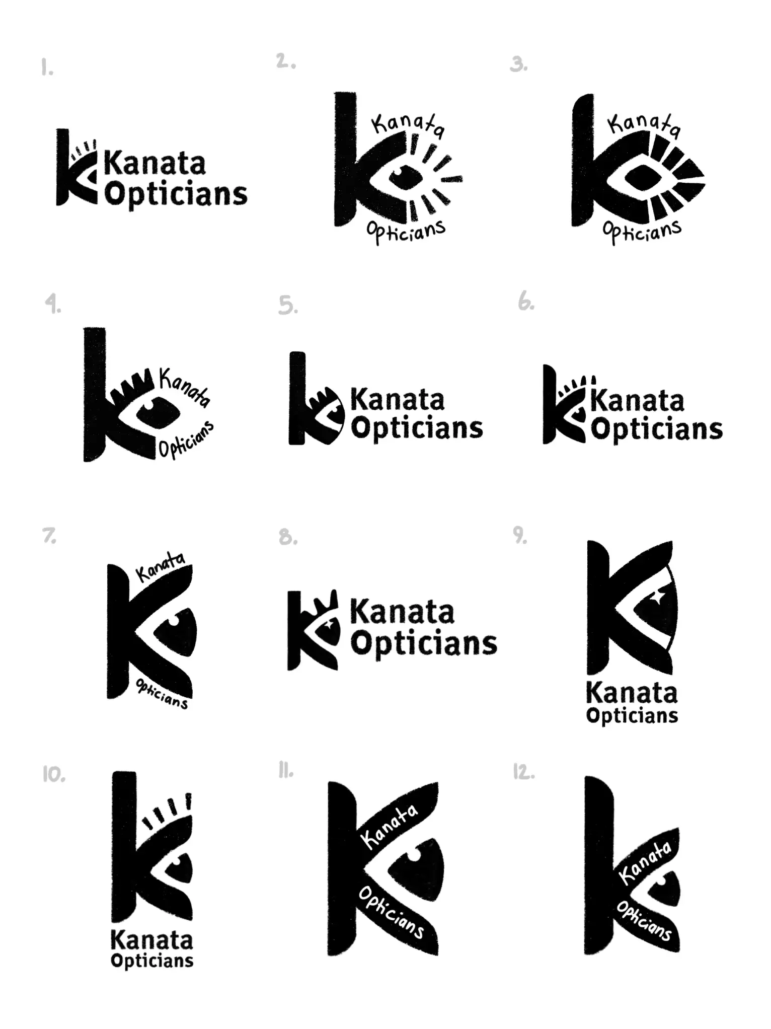
Sample of concept 1 explorations
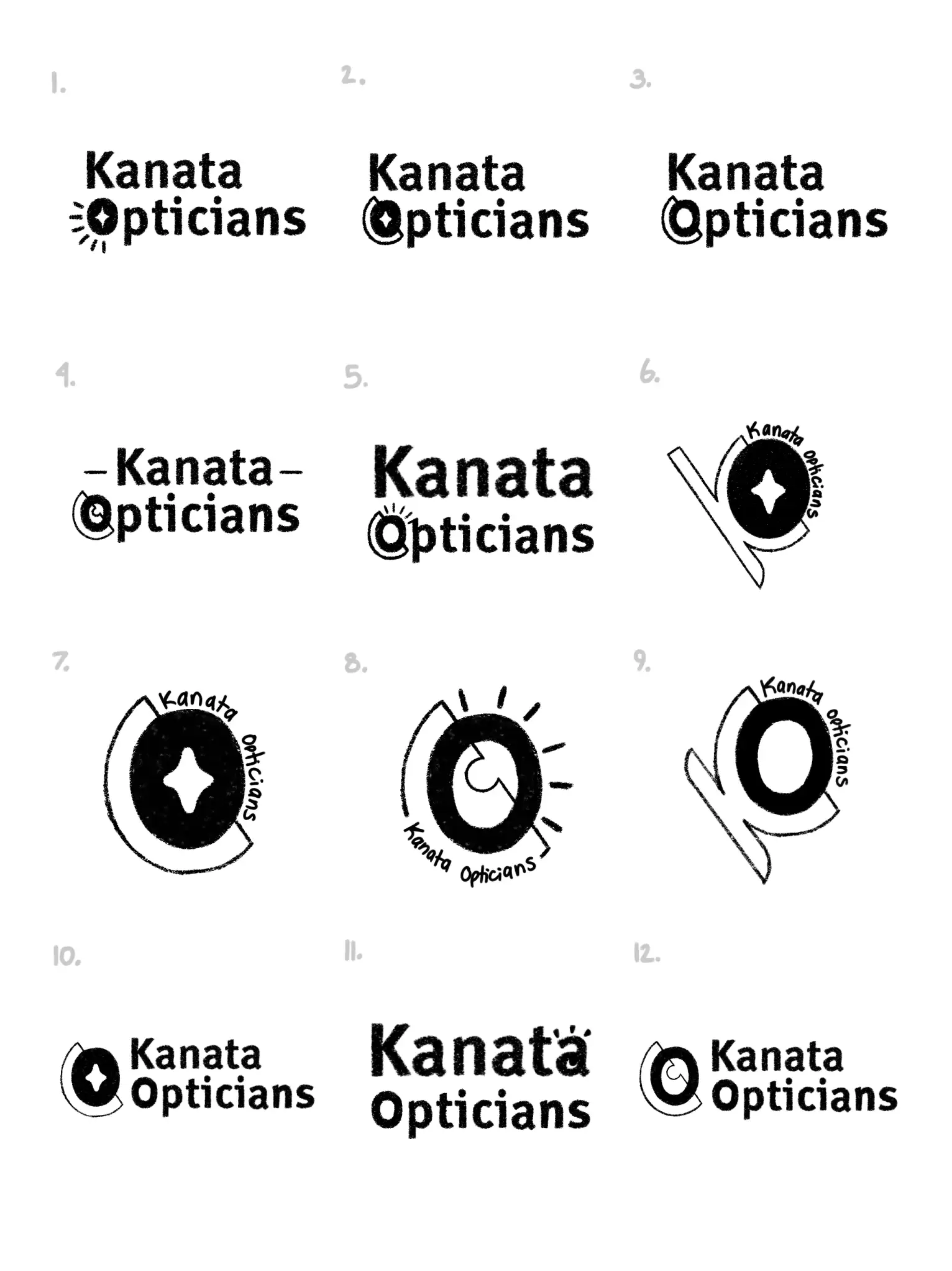
Sample of concept 2 explorations
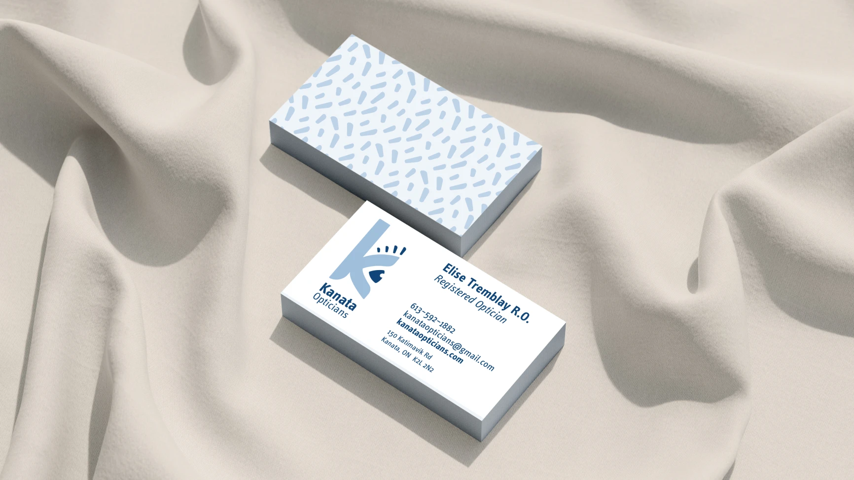
Final Logo.
The final direction uses a stylized K symbol, which reads as simple, clean, and easy to recognize. The spacing and geometry keep it legible at any size, whether it’s on a sign or a small digital touchpoint. The typography used within the logo follows the same idea: bold, high x-height, and softened edges to keep it feeling approachable.

Final logo design
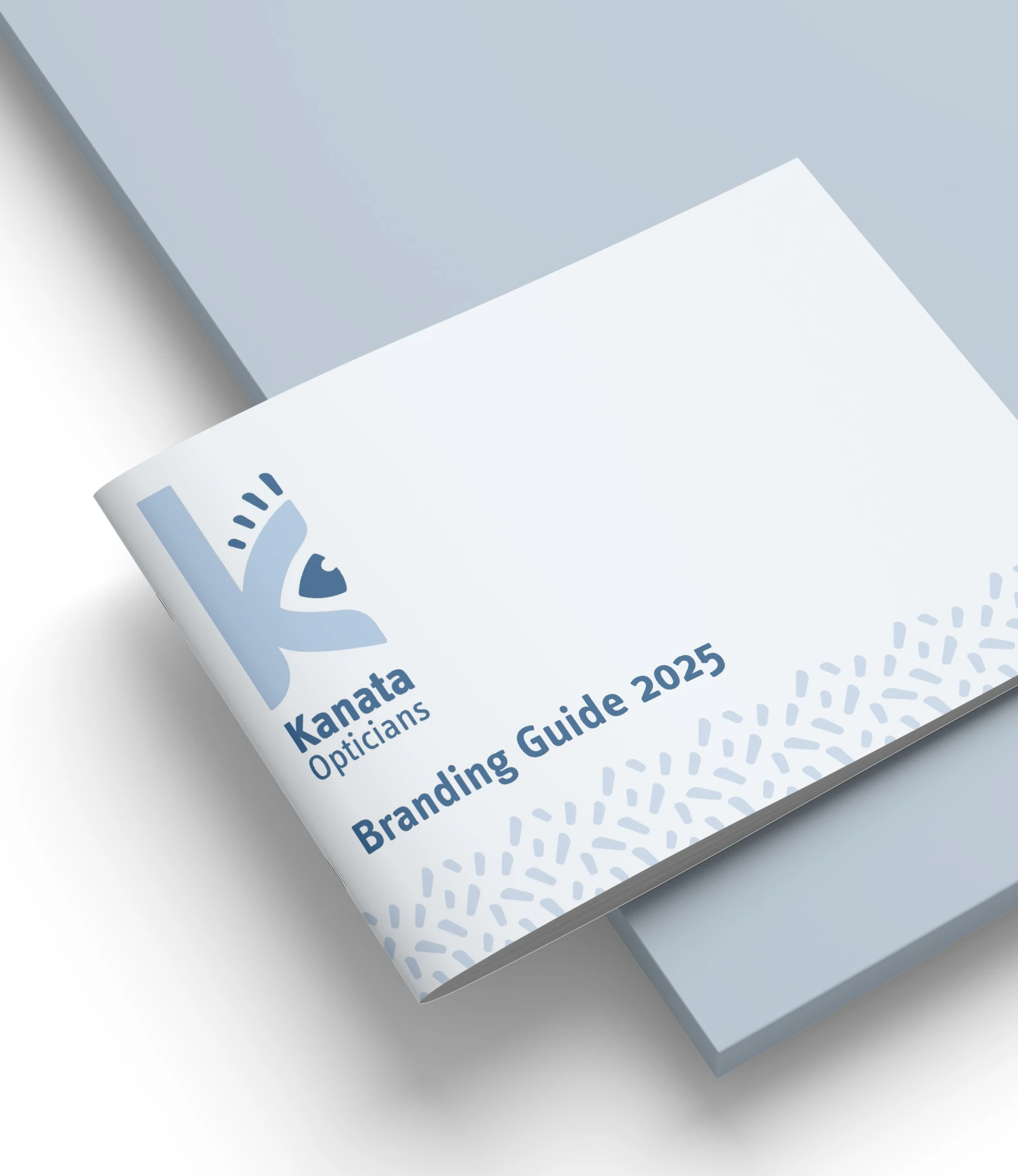
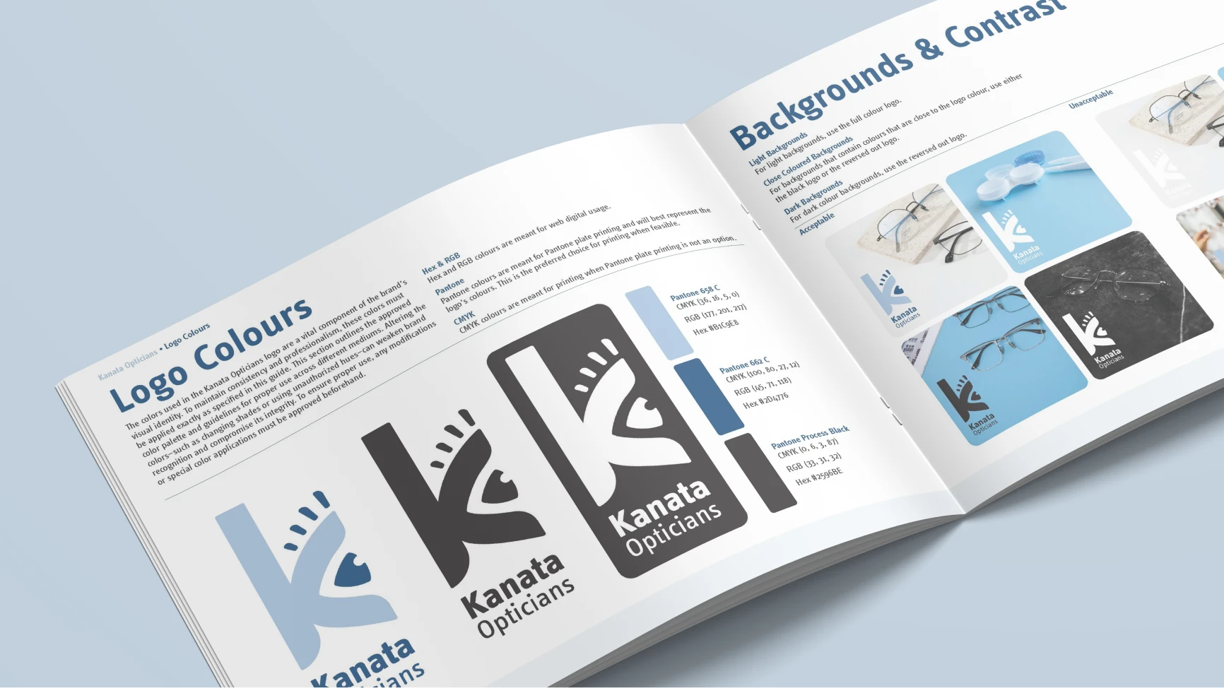
Branding Guide.
The colour palette builds on the original brand colour palette blues, paired with charcoal instead of pure black to keep things softer and more balanced. Typography and ample spacing help guide the eye naturally through any layout. Everything was pulled together into a concise brand guide to keep the system consistent across print and digital touchpoints.
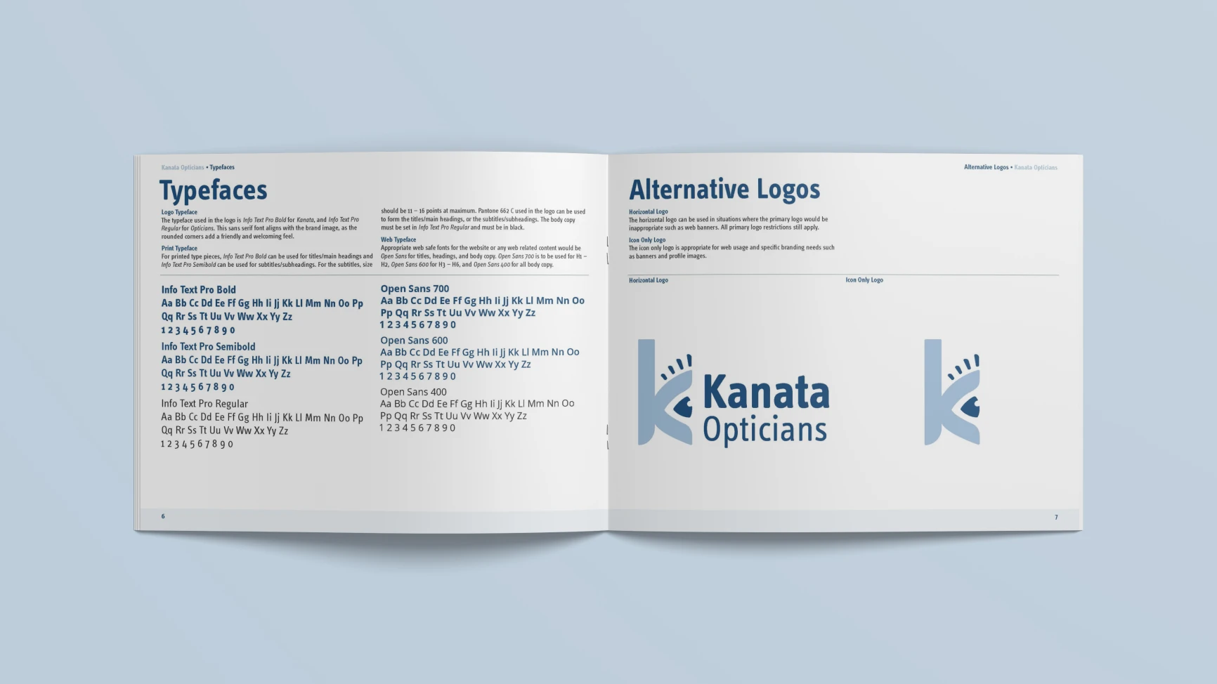
Branding guide typefaces & alternative logos page
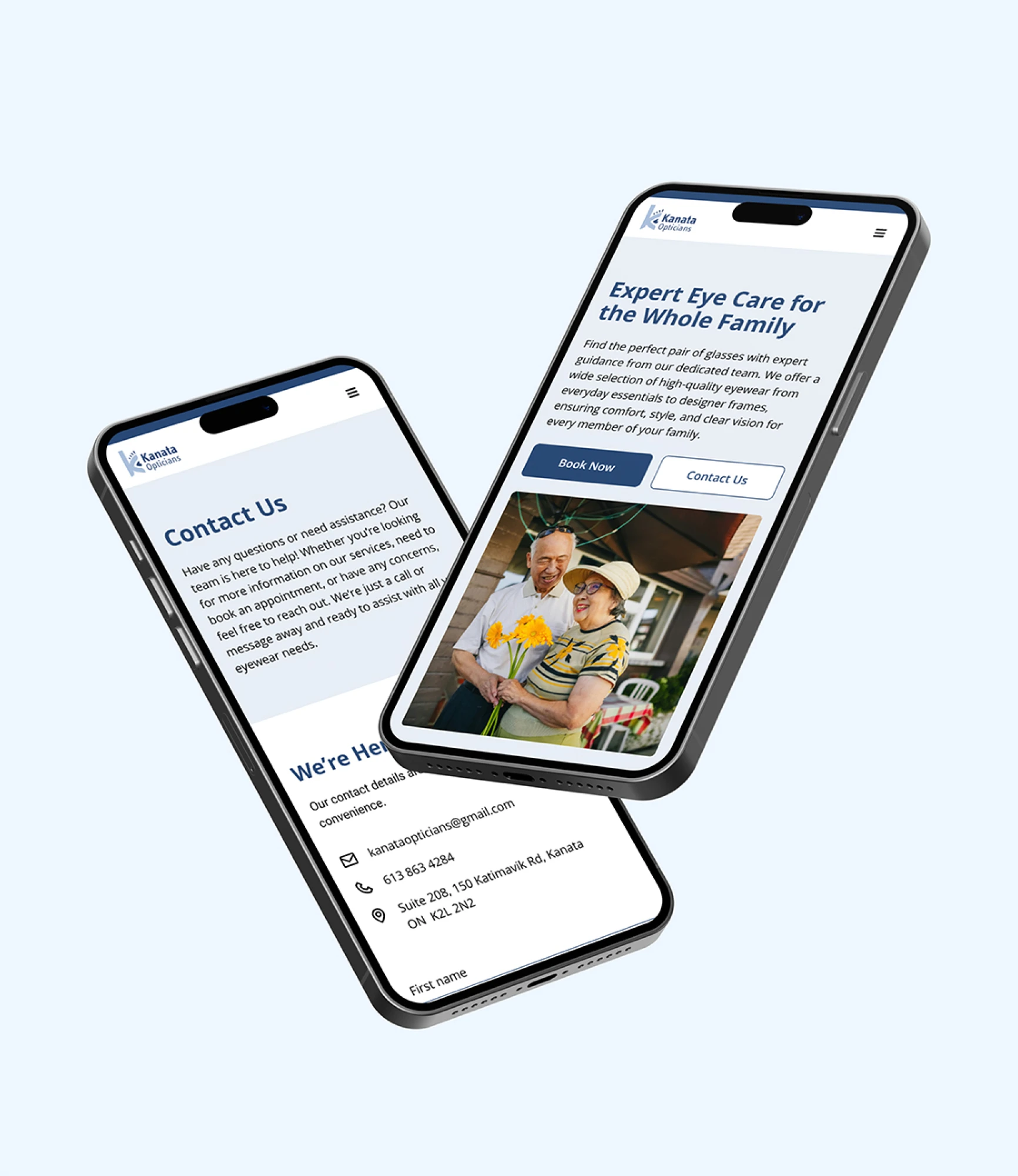
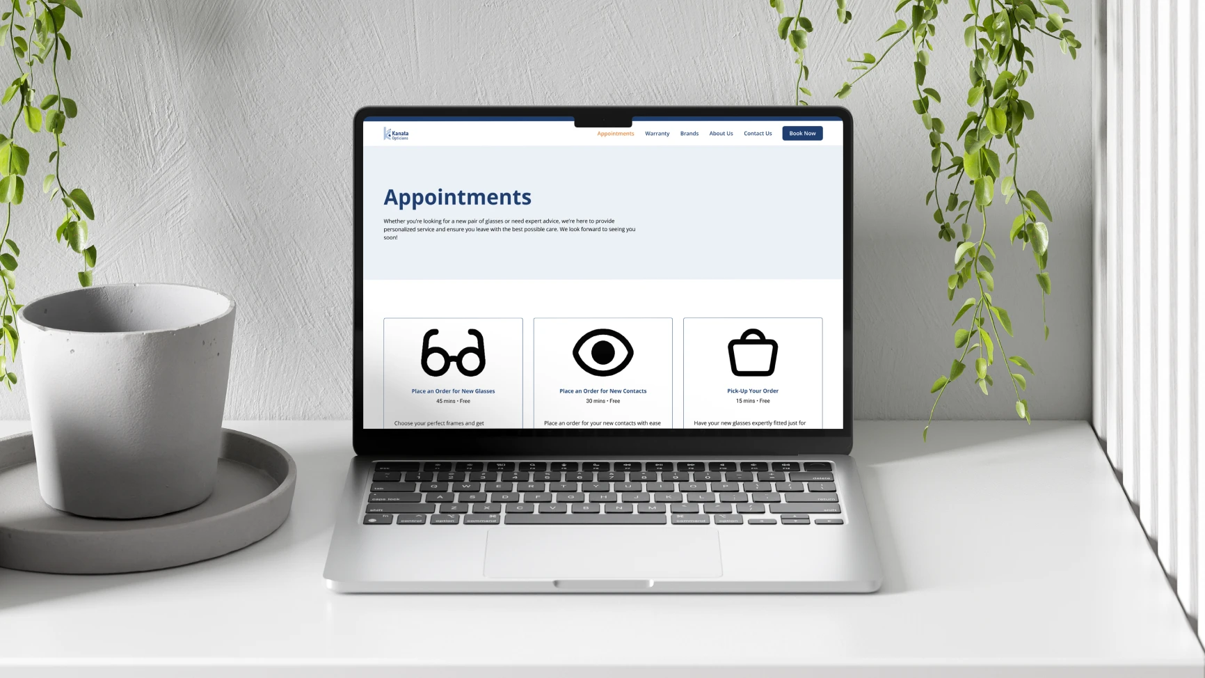
Website Redesign.
The website brings the system into a digital space, with a focus on readability and flow. Using large type, clear hierarchy, and lots of breathing room makes it easy to navigate without overthinking. It was designed in Figma and translated into Webflow.
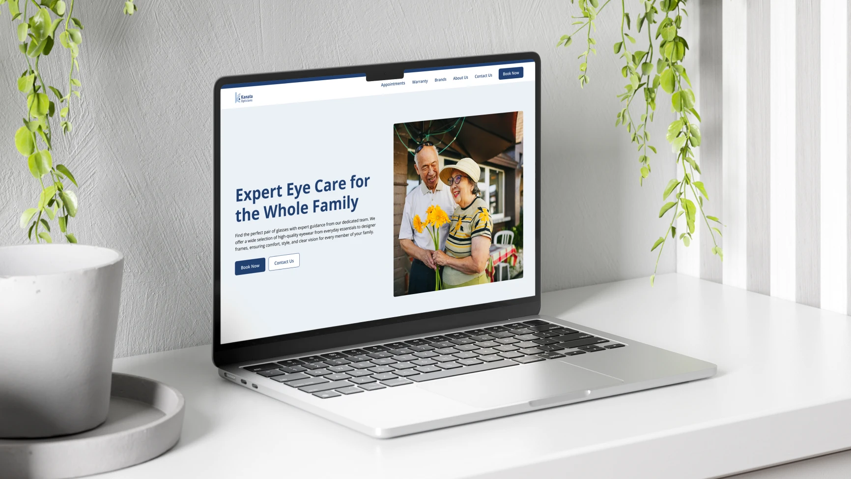
Desktop home page