Mendure App.
Ideation.
Since this was built from scratch, I started by getting all ideas out quickly through rough notes and sketches. From there, I narrowed things down and mapped out the app structure, focusing on one core task: helping users choose and complete a mending technique. This became the foundation for the app map and task flow.
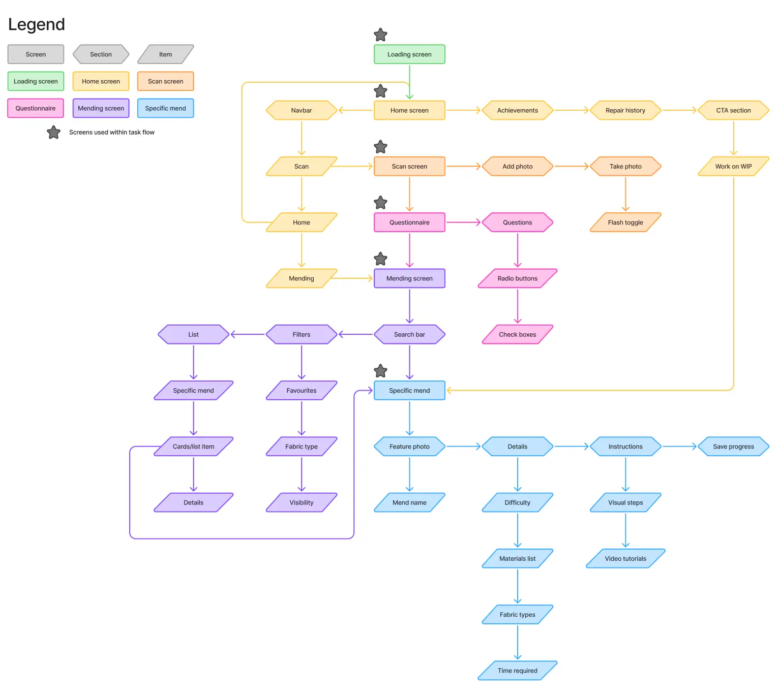
App map
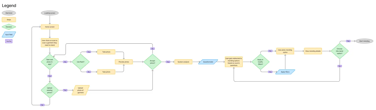
Task flow
Concept Development.
I created initial wireframes and tested them through a focus group to better understand how users interact with the app. The feedback highlighted areas that felt unclear or overwhelming, which guided the next round of refinements. Onboarding was simplified, information made easier to scan, and layouts kept consistent to support navigation. Filters remained visible and accessible, so users can see everything at a glance. From there, I refined the final sketches.
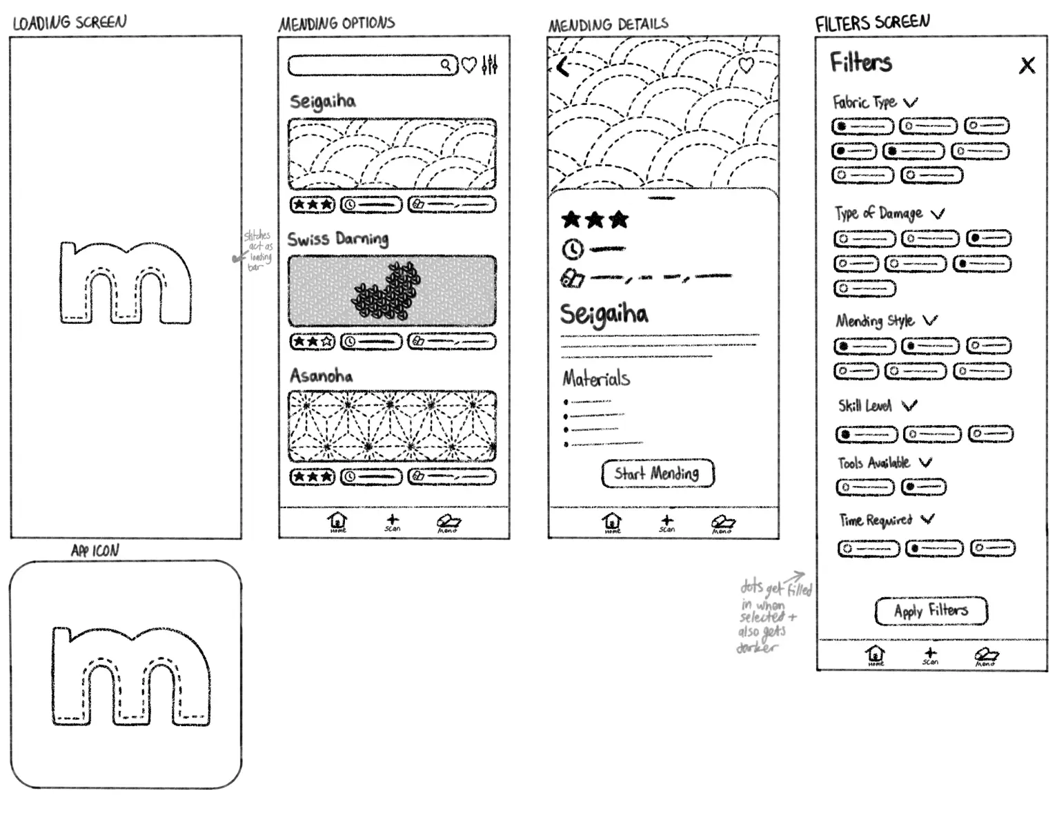
Final sketches after feedback
Wireframes.
Using the insights I collected, I refined the structure into low-fidelity wireframes. These focused on hierarchy, navigation, and making sure each step felt simple and intuitive.
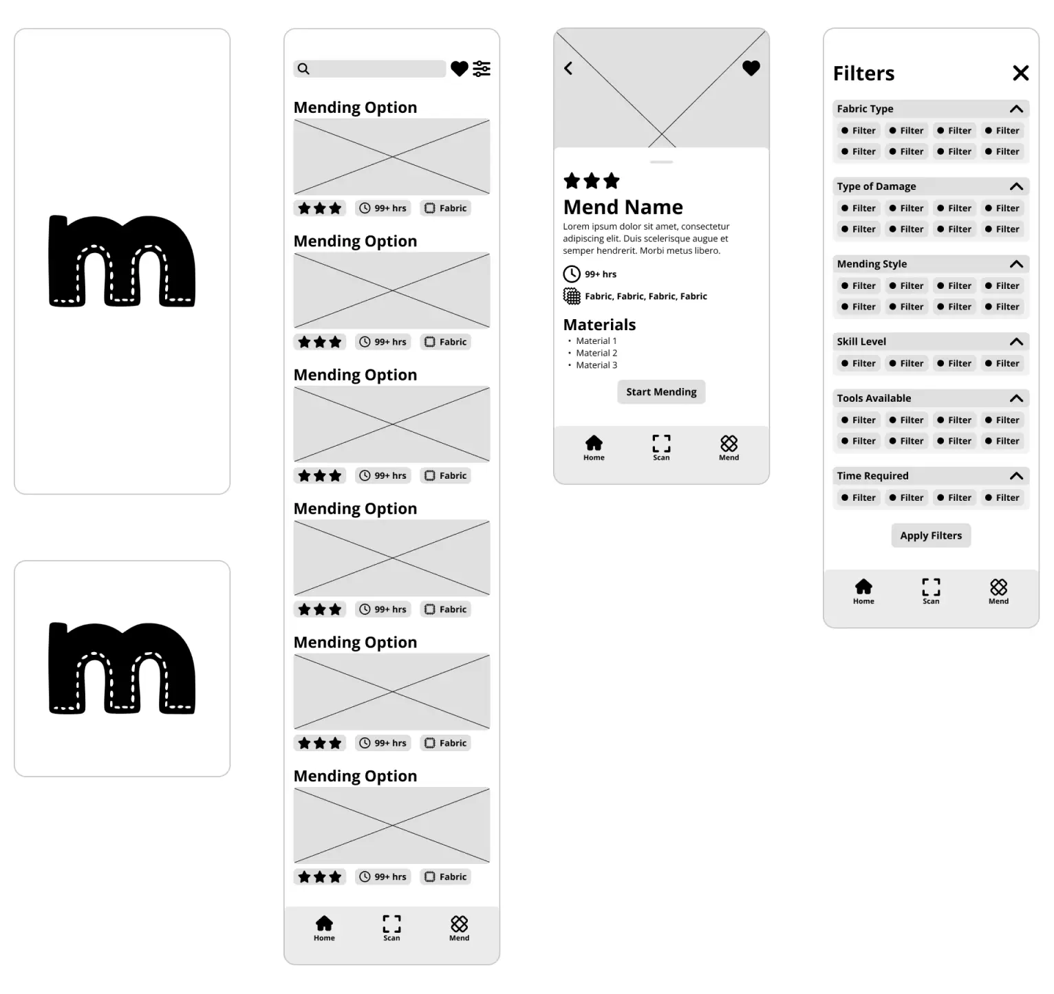
Low fidelity wireframes
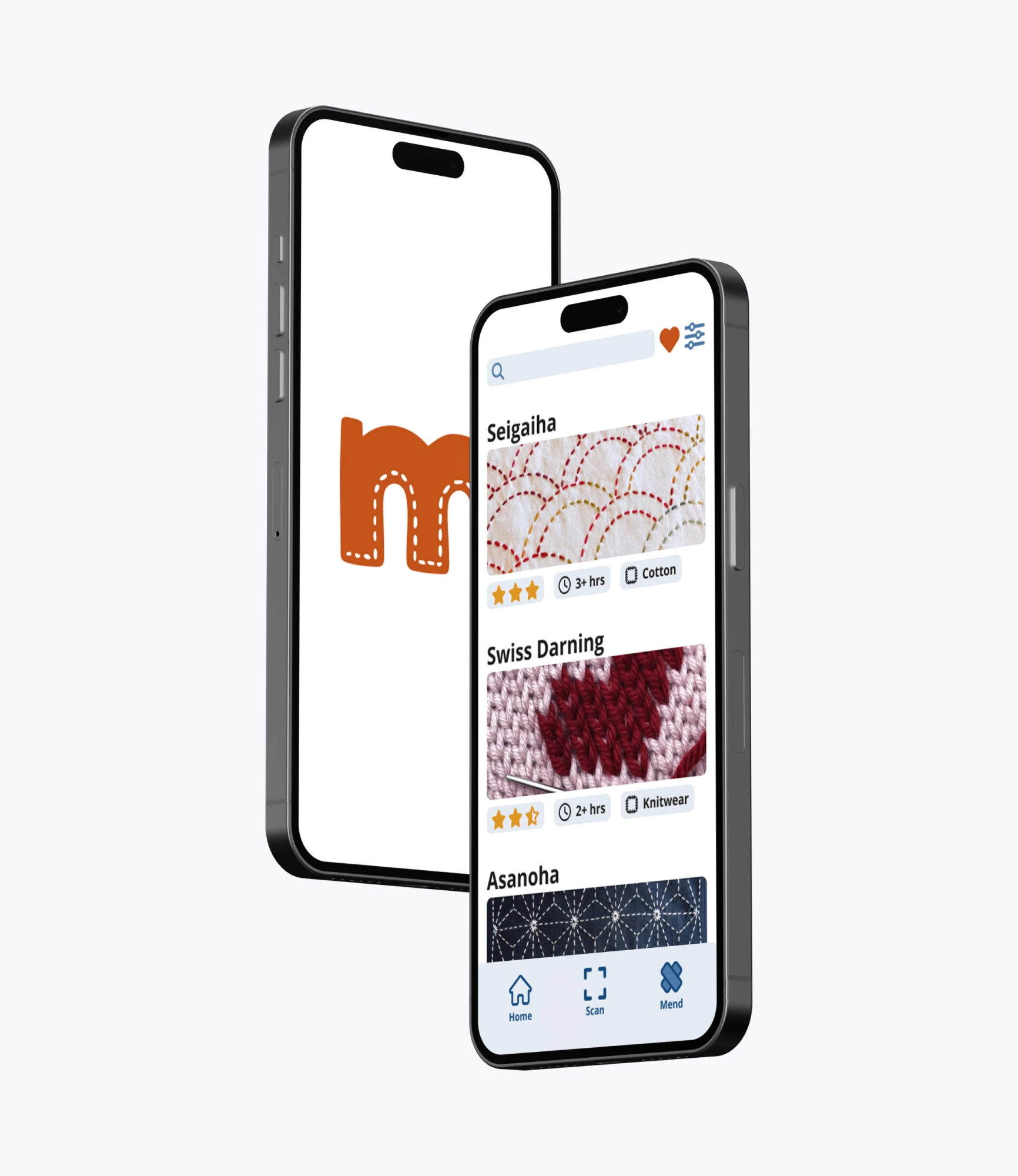
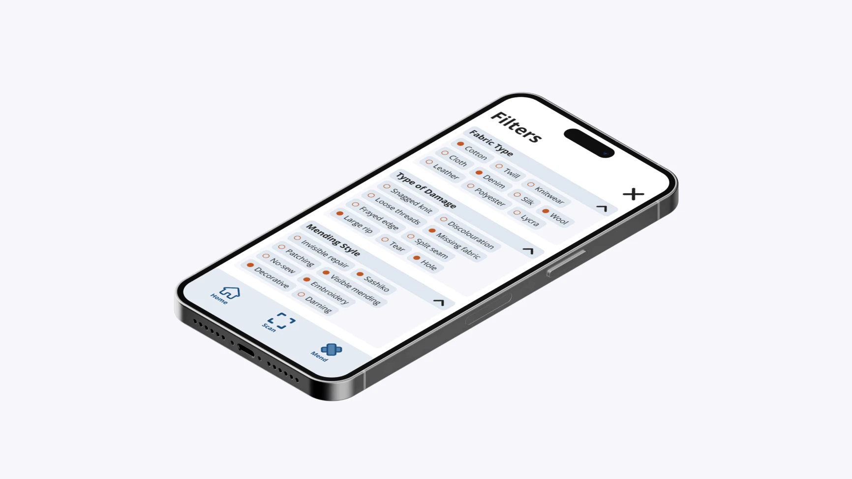
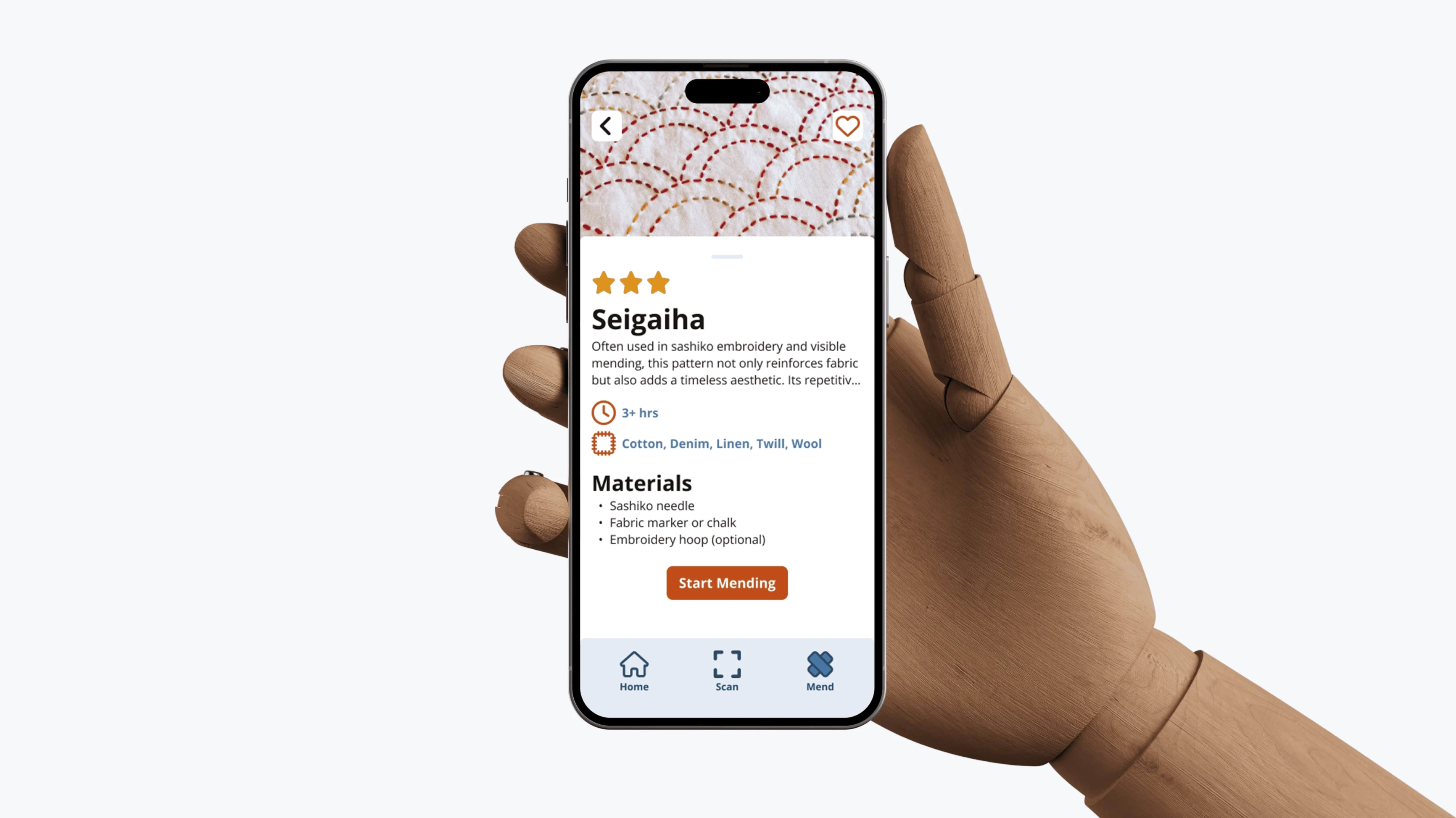
Final Design.
The final interface balances clarity with a more inviting, approachable feel. Using clean layouts, strong hierarchy, and clear visual cues, the final design helps guide users through the process without overcomplicating it. The goal was to make the experience feel easy to follow, even for someone who has never picked up mending before.
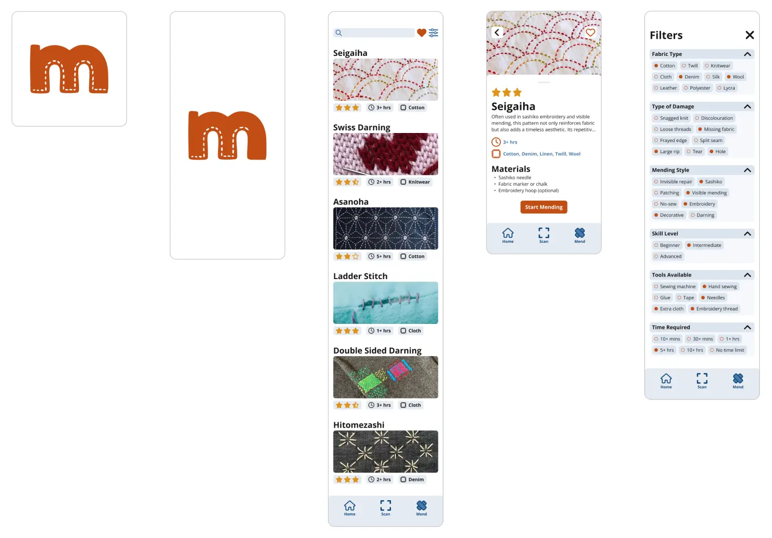
Final design