Understanding.
I started by revisiting my initial analysis and problem statement to identify who this app would truly serve. From there, I defined my target audience and developed two user personas — one primary and one secondary. These helped guide my decisions throughout the design process, keeping me focused on what users actually need and expect from a mending app.
Key Insights
Many people feel intimidated by sewing or don’t know where to start
Sustainability often feels inaccessible or expensive
Users prefer quick, visual instructions over long text-based guides
Mending should feel rewarding and creative, not like a chore
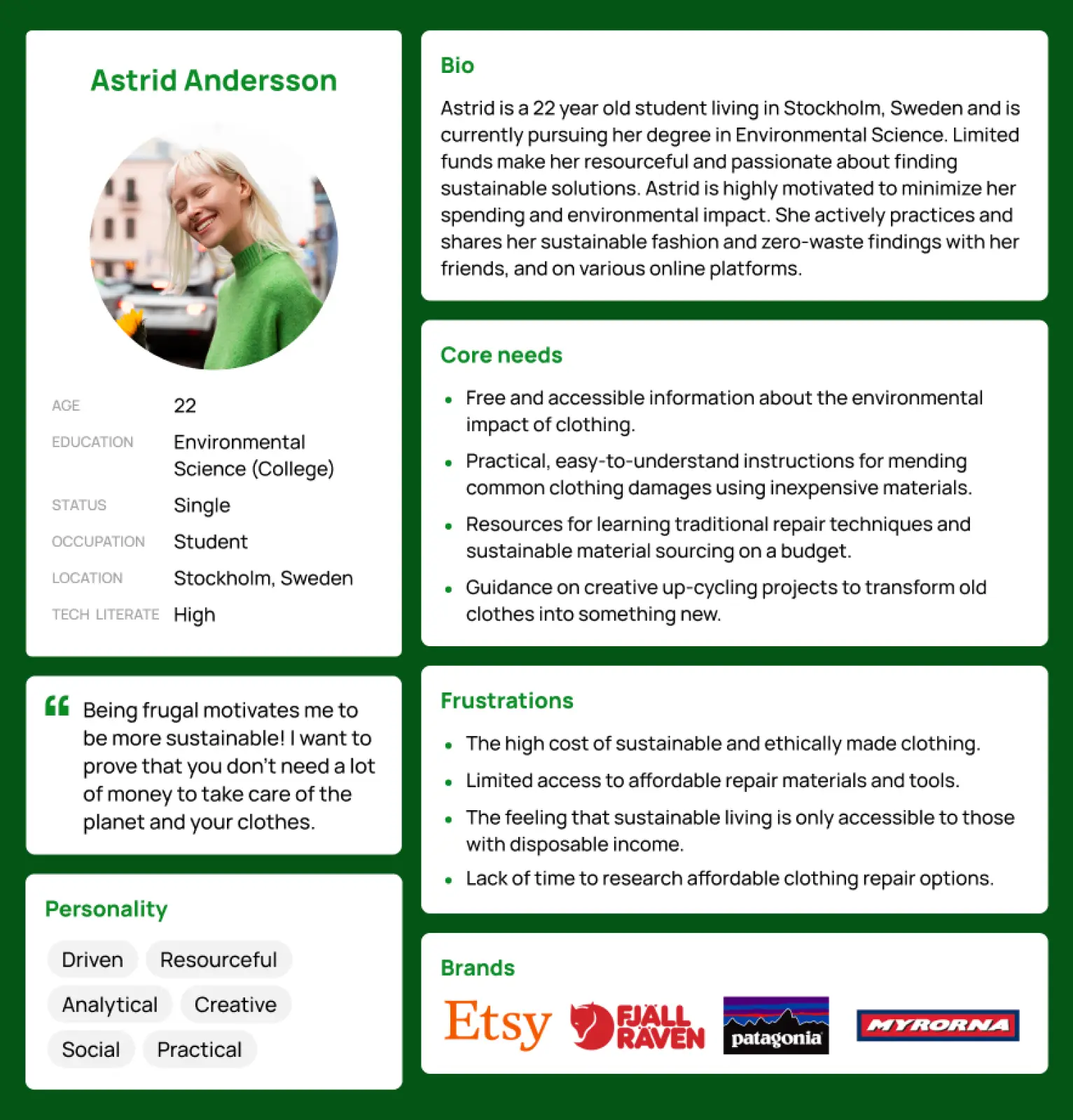
Primary persona
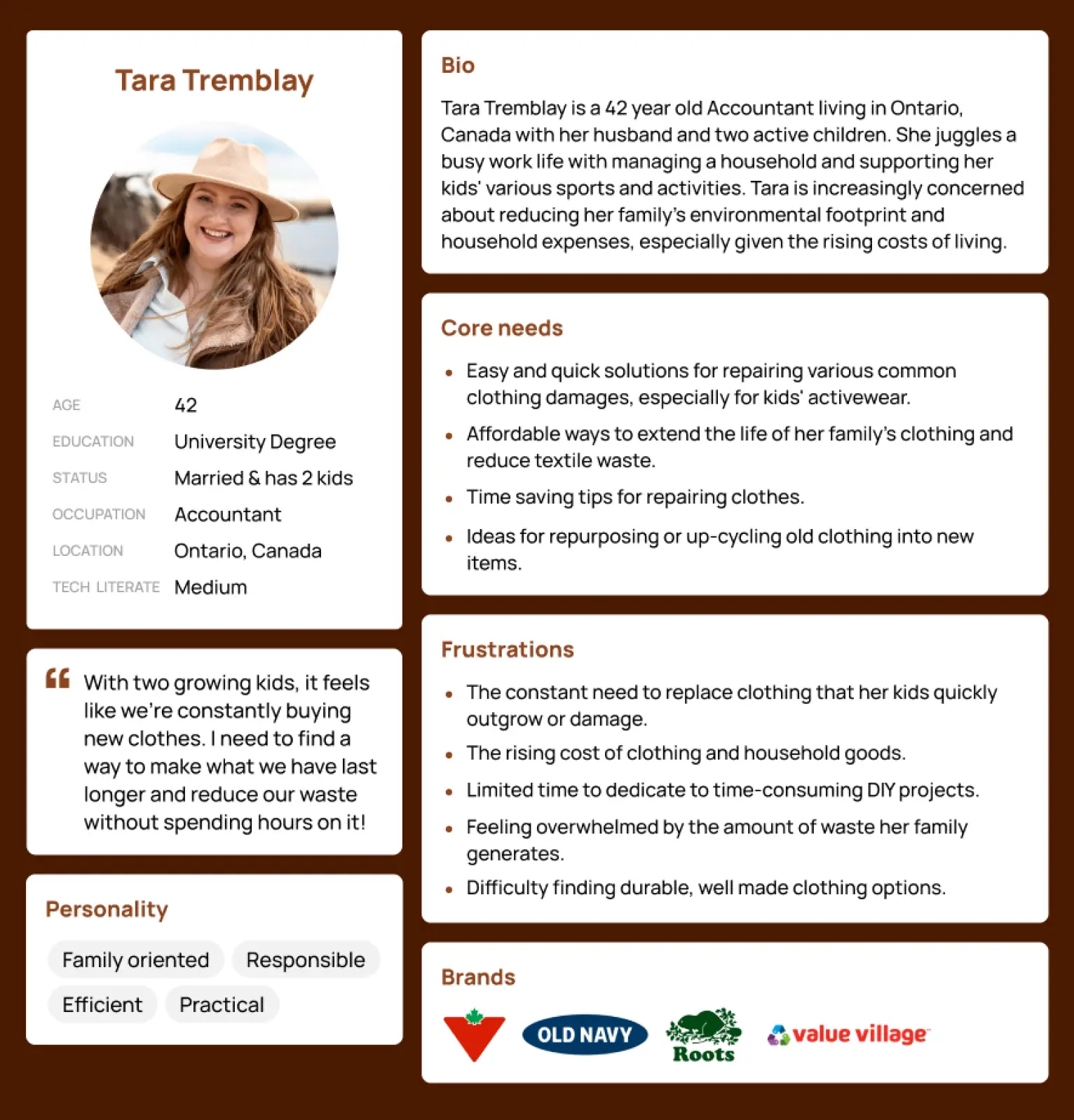
Secondary persona
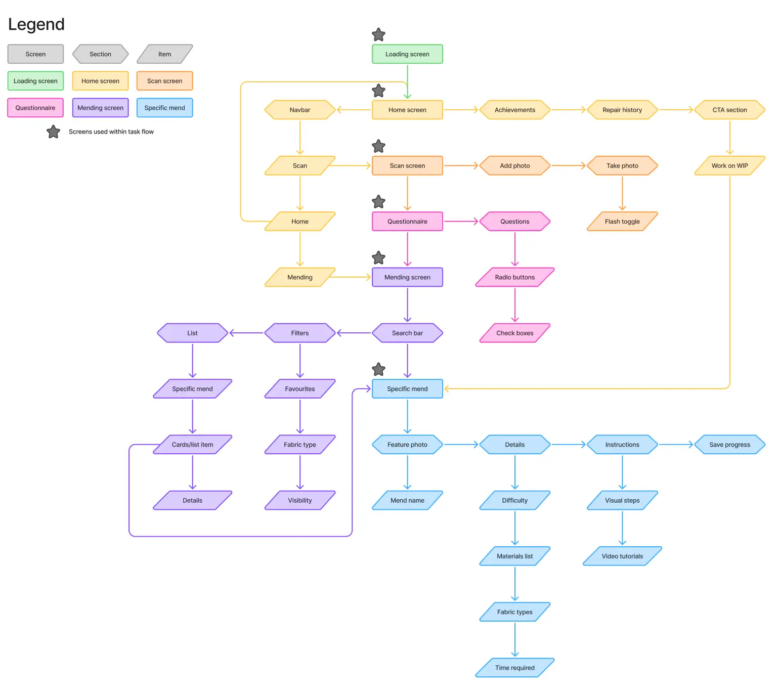
Ideation.
I had many ideas for this app, so I started off with divergent thinking — jotting everything down on sticky notes since I was building from scratch. This helped me visualize all possibilities before sorting them into categories for convergent thinking. From there, I created a sitemap to clarify the app’s structure and focused on one key task: selecting a mending technique. This became the foundation for my task flow and early sketches.
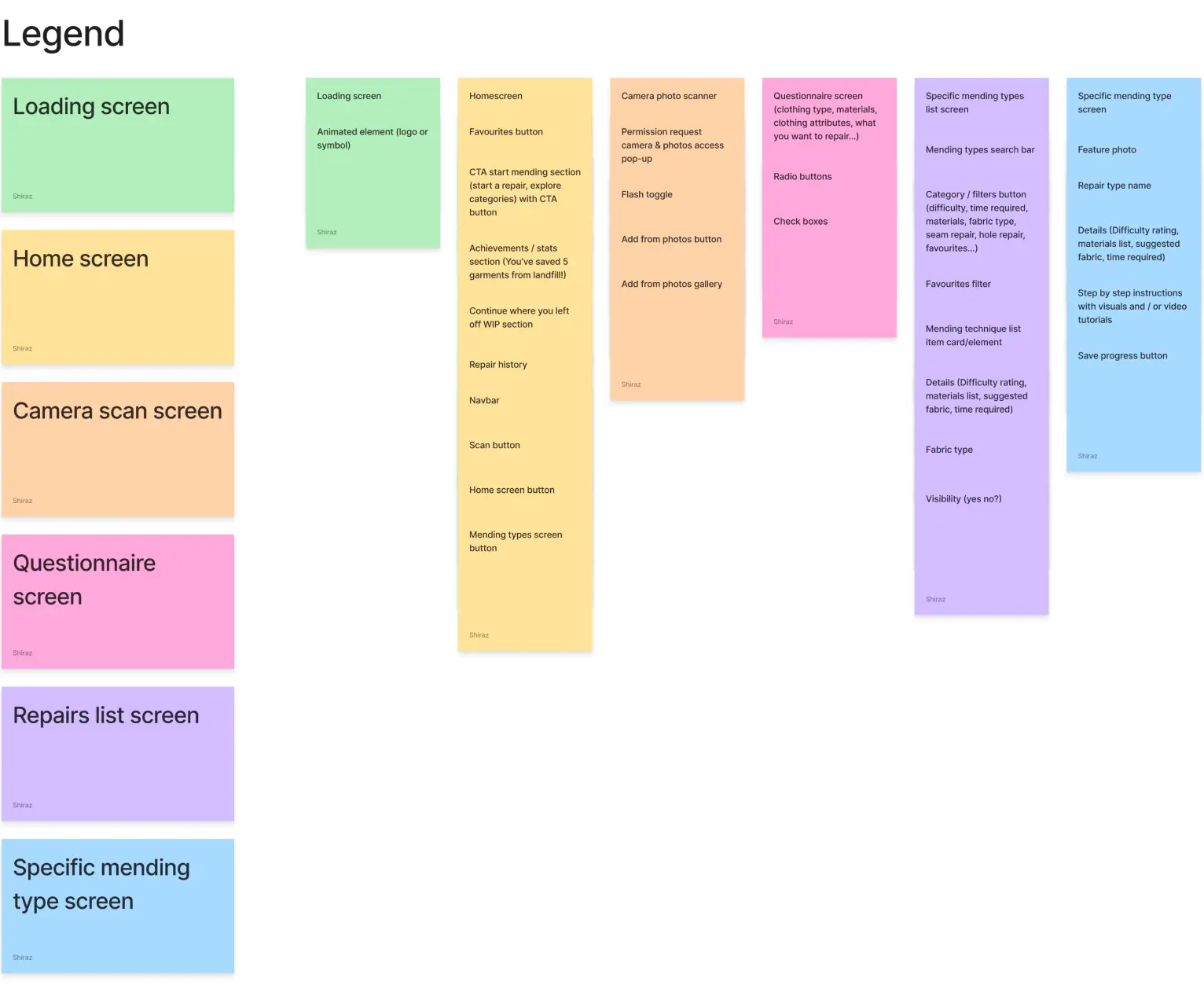
Convergent thinking
App map
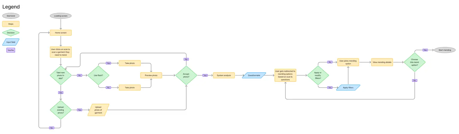
Task flow
Concept Development.
To create the best possible experience, I started by sketching wireframes for each screen. I then hosted a focus group to gather feedback on usability, clarity, and visual hierarchy. Insights from the session helped me refine layouts and interface elements to make the app approachable, intuitive, and beginner-friendly.
Key Insights
Loading & onboarding: Needed a clear, engaging introduction that guides users naturally into the app
Mending options layout: Information should be easy to scan, with key details immediately visible
Mending details clarity: Consistent placement of details ensures users quickly understand everything
Filters visibility: Keeping filter categories visible prevents confusion
Visual consistency & branding: Stitching visuals, icons, and interface elements should reinforce the brand and create a cohesive, inviting experience.
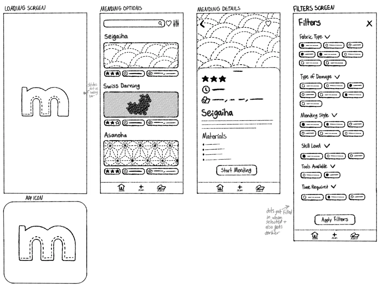
Final sketches
Low Fidelity Wireframes.
After gathering feedback from the focus group, I refined my sketches into final low-fidelity wireframes. These wireframes defined the app’s structure, hierarchy, and core interactions, ensuring that each screen was intuitive, easy to navigate, and aligned with user needs.
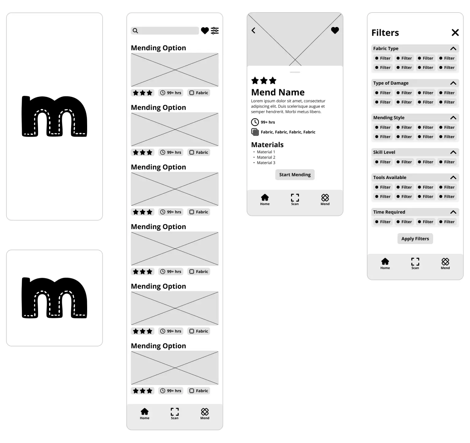
Low fidelity wireframes
High Fidelity Design.
With the style guide and wireframes established, I developed the high-fidelity screens and interactions. The final design balances usability and approachability, ensuring users with little to no sewing experience can navigate the app confidently while enjoying the process. Visual elements, hierarchy, and spacing were carefully refined to make the app intuitive and engaging.
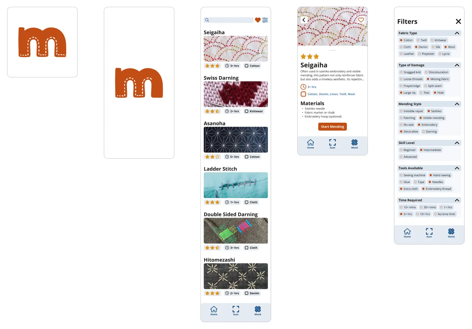
Final design
